Show the experiment.
Material imagery gives the studio a tangible visual starting point. Visible generated-image captions explain what the images are; they do not stand in for manufactured objects or client photography.
 Moreoh
Study 01 / Internal interface study
How can a studio introduction become a clearer route from first impression to a useful enquiry?
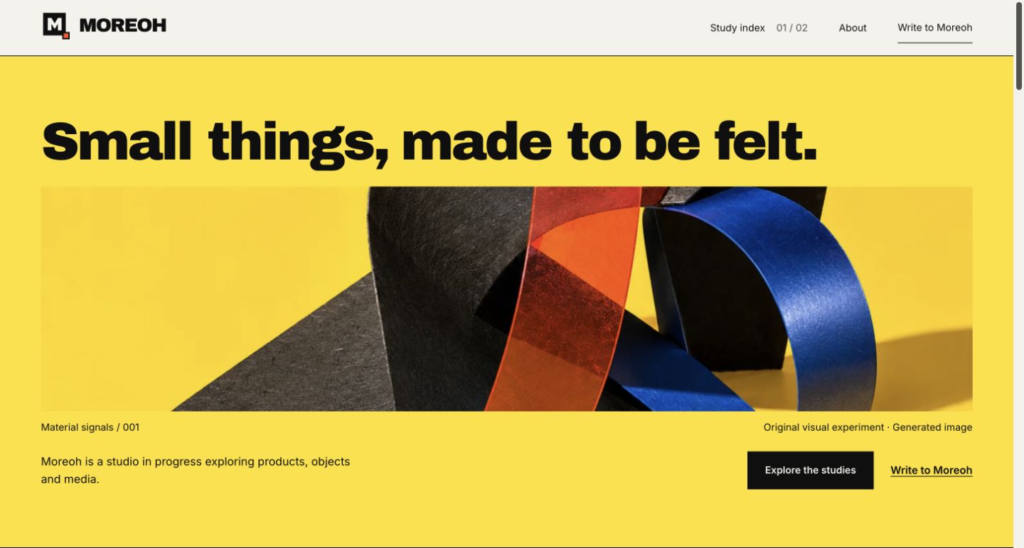
A holding page can establish a visual identity and still leave a visitor unsure what the studio is doing. This study keeps Moreoh’s direct typography and block-M identity, then gives that introduction a clearer structure.
The constraint is simple: the studio is in progress. The page must explain the work that exists without borrowing the credibility of clients, finished products or results that have not been established.
Material imagery gives the studio a tangible visual starting point. Visible generated-image captions explain what the images are; they do not stand in for manufactured objects or client photography.
Each study has its own page, readable context and a specific boundary. The short index leads into the question, decisions and limits, rather than implying a portfolio of commissioned work.
The invitation desk prepares an editable email draft. A visitor can review, copy and choose to send it. Preparing a note does not create a subscription or prove delivery.
This website introduces the studio, opens up two studies and gives each one a route into a conversation. Visitors can read the work, prepare a note with its context and review the text before choosing to send.
It is Moreoh’s own interface study, with no measured business outcome claimed.
Prepare a note with this study attached as context. You can change the subject or remove it before reviewing the draft.
Write about this study